I came across three charts this weekend that I think are worth sharing because they pass all the tests above.
The first chart shows the control of state capitals since 1938. The red represents the number of states where both houses of the state legislature and the governor were controlled by the Republicans. The blue represents where the same is true for the Democrats. Gray indicates where there is some type of shared control in the state.
 |
| Source: National Conference of State Legislatures as reported in The New York Times |
Notice that it has been 50 years since the Republicans controlled so many states. There has also never been a period since 1938 when the Republicans made more gains in state government than in the years since Barack Obama became President. This does not look like a political party that is having difficulties in connecting its message with a changing demographic.
The second chart I came across involves the disastrous state of the public pension costs facing the state of Illinois. Illinois is a state that has been controlled exclusively by Democrats in its state house since 1982 except for one two-year Republicans majority in the mid-1990's. Democrats have controlled both houses of the legislature and the governorship since 2003. This shows what happens when a political party is owned by the public sector unions.
The share of total revenue the state collects that must be used for annual pension costs has risen from 3.6% in 1996 to 22.0% in 2013. It is headed for nearly $3 dollars for every $10 in revenue by the end of this decade.
 |
| Source: Institute for Illinois' Fiscal Sustainability |
There is no question in my mind that Illinois is headed for bankruptcy. They seem to have gone beyond the point of no return. Remember, this is a state that increased individual income tax rates across the board by 66% (from 3% to 5%) and corporate tax rates by 45% last year. How high do taxes need to go to fill this hole? There will be few taxpayers left who will want to pay that bill.
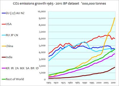
The third chart deals with CO2 emissions. Remember the Kyoto Protocol in 1997 that the liberals argued was absolutely critical for the United States to adopt to save the planet? Of course, 70% of the world (including China and India) were exempt from the treaty. The U.S. Senate voted against Kyoto 95-0 in 1997. However, this is another issue that many on the Left still like to blame on George W. Bush as he refused to endorse adoption of Kyoto in his Administration. Of course, the Senate during the Clinton-Gore administration made it clear that the United States would not sign Kyoto if it excluded China, India and other countries. The Bush position was identical to the Senate position in 1997 but why let a little fact like that get in the way? How has carbon emissions growth worked out since that time?
Notice that China's emissions have almost tripled since 1997. India's have doubled. Carbon emissions in the United States are lower today than they were in 1997. China is now emitting about 50% more carbon emissions than the United States.
I found it interesting in researching this subject that last December Canada pulled out of the Kyoto Protocol that it had agreed to in 1997. It did so to save an estimated $14 billion in penalties. In making the announcement the Environment Minister of Canada blamed an "incompetent Liberal government who signed the accord but took little action to make the necessary greenhouse emissions cuts".
Who was right on Kyoto? What exactly has it accomplished compared to what it was supposed to accomplish? It looks to be nothing if the goal was to reduce worldwide carbon emissions. Of course, that was not the real goal anyway. The real goal was to attempt to soak the rich (the United States) with enormous financial penalties which is a favorite past time of the far left. Why are facts like these so often swept under the rug by the liberal media?
 |
| Credit: Watt's Up With That |

This is a fabulous post, and it's the first time I have visited your blog. I was wondering if I could re-post this on my own blog, thenakeddollar.blogspot.com? Full attribution, of course, and a link.
ReplyDeleteScott,
ReplyDeleteI am glad you liked the post. You are welcome to re-post this or any other posts that you think your readers might benefit from. I saw your post on Atlas Shrugged a few weeks ago. Good stuff!
Just posted, and thank you. Btw, Scott McNealy turned me on to you. You have some good readers!
ReplyDelete