
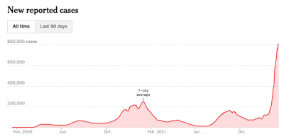
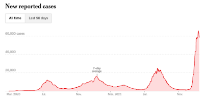
There are signs that this week will mark the peak of this Winter's Covid surge.
The chart of daily cases indicates that we are very close to reaching a peak in the 7-day average of new daily cases.
if you look closely you can make out an almost imperceptible peak forming as a result of slowing case growth.
 |
| New Daily Covid Cases in the United States-7 day average Source: The New York Times |
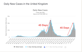
This week will mark 45 days since the current so-called Omicron surge began.
I have written previously about the fact that Covid surges typically follow a pattern in which cases rise for approximately 45 days before they begin to fall at the same rate they rose.
This is what I wrote about this phenomenon in my blog post "The Illusion of Control" last August.
There seems to be a pattern with Covid in which cases surge for 45 days when a major outbreak begins until it turns down.
You can observe this pattern in the UK in the wave last Winter as well as the recent so-called Delta variant wave.
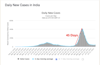
You can see the same pattern in India where the Delta variant is reported to have originated.
At the time I wrote that blog post Florida was experiencing a major seasonal summer surge just as it had in 2020.
Based on the 45-day pattern I predicted that Florida's surge would soon end and cases would decrease at the same rate that they have increased.
This would mean that daily cases would return to about the same level they were at in another 45 days after reaching the peak (90 days from the beginning of the surge).
This is exactly what occurred.
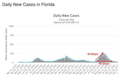
This pattern seems to repeat itself regardless of the interventions that are implemented.
Florida's cases came down without mask mandates, lockdowns or vaccine mandates even though Dr. Fauci and the experts were predicting that disaster loomed in that state in the coming weeks with schools opening.
If we follow the same pattern again it would appear that we will reach the peak in Covid cases from this surge nationally sometime this week.
The current surge in the United States generally began in the first week of December in most parts of the United States. The surge started earlier in the Northeast and later in the Western states.
For example, in New York the case surge seems to have started on November 28.
The peak has apparently already been reached on January 9---42 days after it started.
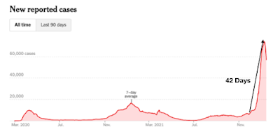 |
| New Daily Covid Cases in New York- 7 Day Average Source: The New York Times |
Note that the average daily case case appears to be falling at the same rate as it increased.
Massachusetts is another state that appears to have hit its peak and started down 42 days after it began.
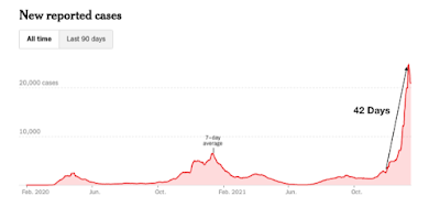 |
| New Daily Cases in Massachusetts-7 day average Source: The New York Time |
 |
| New Daily Cases in Florida-7 day average Source: The New York Times |
Cases in California did not begin surging until two weeks after the Northeast surge.
Daily cases are still increasing.
However, I would expect the peak to be reached in California within the next week or two.
You can already see indications in the chart that daily case increases are slowing.
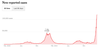 |
| New Daily Cases in California- 7 day average Source: The New York Times |
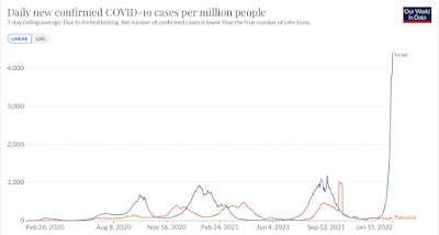
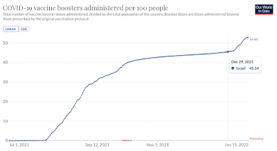
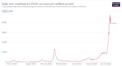
Is it also a coincidence that the United States has boosted less than half of the percentage of its population as Israel and Ireland and is seeing significantly lower average daily case counts than these two countries?
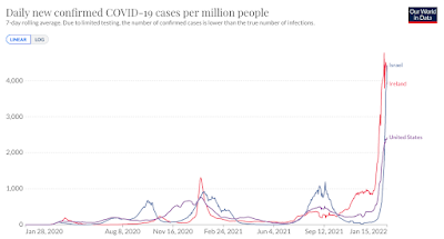
Joe Biden and his Covid "experts" are pushing for everyone to get booster doses as the way out of the pandemic.
However, it appears that more and more people are tuning out the narrative and looking at what is going on around them.
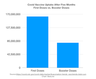
The boosters were first recommended for immunocompromised individuals in the middle of August. They were generally recommended for everyone age 18+ in the middle of September.
To this point, about 80 million booster doses have been administered.
By comparison, at a similar time period after the Covid vaccines were first introduced, 160 million Americans had received at least one dose.
That indicates half they people who got the original vaccine doses are being much more deliberative about being jabbed again.
The way out of the pandemic is for everyone to get boosted?
Would it not be ironic if the best way forward is actually having millions upon millions of people making a decision to do the exact opposite of what they are being told?
People looking at the data, seeing what is happening around them and perhaps taking account of their prior experience with the vaccine and deciding that what they are being told is not in their best interests.
That would be weird wouldn't it?
It might be as "weird" as what we are seeing in Scotland as it is the unvaccinated have lower admissions rates for hospitalization than those single, double or triple jabbed.
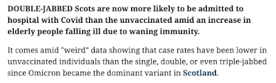 |
| Source: https://www.heraldscotland.com/news/19843315.covid-scotland-case-rates-lowest-unvaccinated-double-jabbed-elderly-drive-rise-hospital-admissions/?ref=twtrec |
It is called "weird" data in the newspaper article.
What if it is not "weird"?
What if it is what it is but none of the "experts" wants to admit it?
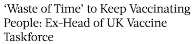
One expert in the UK is looking at the data and has declared it is a "waste of time" to keep vaccinating people. Why? It is because it is now clear that these vaccines don't stop infection and transmission. Therefore, the focus should solely be on managing the virus in order to protect those who are most vulnerable by stopping the progression to severe disease in these individuals according to Dr. Clive Dix.
 |
| Source: https://www.theepochtimes.com |
Will we see more "experts" coming to this conclusion?
Bookmark this post and check back in two months.
Is the fact that the vaccinated appear to more vulnerable to Omicron than the unvaccinated mean that the data should be referred to as "weird"?
Is the 45 day pattern "weird" or real?
Am I correct in predicting this is peak week?
As always, the data does not lie.
We will find out the answers to all these questions together over the next 60 days.
No comments:
Post a Comment