I have written about Covid-19 since January.
From the beginning I thought it was necessary to take the virus seriously.
I supported the actions taken in mid-March in order to stop the spread and flatten the curve. I stated that these seemed to be smart, common sense measures to take given many of the things we did not know about the virus at that time.
However, around the end of March (at the end of the 15 days to stop the spread campaign) bells started to go off in my head.
The reality I was seeing did not match the models that were being used to justify the enormous economic costs and long-term implications of the mitigation efforts.
As an example, I referenced this chart in my blog post of March 29, 2020 that was the projection of deaths in Ohio from Covid-19 from the website CovidActNow. This was similar to the models being used by public health officials in Ohio to justify the actions taken.
That model projected 7,000 (best case) to 174,000 deaths in Ohio over the next three months from Covid-19 assuming the shelter in place order remained in effect during that entire time period.
 |
| Source; CovidActNow, March 29,2020 |
I wrote the following at that time regarding these projections and those of Ohio's Public Health Director, Dr. Amy Acton, who stated that Ohio would see a peak of 100,000 cases per day by mid-May.
I must admit when I first heard that number it was hard to process it. I am not an expert epidemiologist or public health expert. I know that exponential infection rates are hard for the mind to process. However, I am a numbers guy and I have to tell you that at first glance that model does not pass the smell test to me.
I could be 100% wrong. This might prove to be the dumbest and most misinformed blog post I have ever written. However, let me give you are a few reasons that I question that conclusion.
It is now almost 150 days later and we can look at the actual facts of what has occurred in that span.
You can look at the facts below and make your own assessment of whether my instincts were right or wrong at the end of March.
Ohio never saw 100,000 cases of Covid-19 in one day.
The highest daily total of confirmed cases Ohio has seen is 2,172. However, well over half of the cases reported that day (April 16) were prisoners at Marion Correctional Institution.
In fact, five months later, Ohio has just recently passed 100,000 confirmed cases in total in a state of almost 12 million people in a period of six months.
 |
| Source: https://coronavirus.ohio.gov/wps/portal/gov/covid-19/dashboards |
What about the predictions that Ohio would have 7,000 (best case) to 140,000 (worst case) deaths by the end of June even if we sheltered in place for three months?
 |
| Source: https://coronavirus.ohio.gov/wps/portal/gov/covid-19/dashboards |
Ohio has still not reached 4,000 deaths five months after that three month projection was made.
For context, in a typical year Ohio registers about 2,500 deaths per month or 30,000 deaths per year.
I prepared the chart below comparing all cause deaths in Ohio from March through May in 2019 and 2020 based on CDC data to show the effects of Covid-19 on total deaths in the state. As you can see from the chart above, this would be the period encompassing a majority of the deaths thus far. This data should also be complete and reliable. Later deaths may still not have been reported as there is typically a lag in death reporting stats.
 |
| Source: https://data.cdc.gov/NCHS/Weekly-Counts-of-Deaths-by-State-and-Select-Causes/muzy-jte6 |
There is no question there have been excess deaths in Ohio from Covid-19. However, the data suggests that excess deaths are only about half of what is being reported as total deaths from Covid-19.
I did similar research with New York's death numbers.
This is the comparison of all cause deaths in New York in 2019 and 2020 for the March-May period.
New York clearly had a horrible six weeks between April and May 15.
For several weeks deaths were more than double their normal rate.
 |
| Source: https://data.cdc.gov/NCHS/Weekly-Counts-of-Deaths-by-State-and-Select-Causes/muzy-jte6 |
It is rather shocking.
 |
| Source: https://data.cdc.gov/NCHS/Weekly-Counts-of-Deaths-by-State-and-Select-Causes/muzy-jte6 |
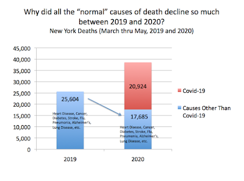
The only conclusion that can be drawn is that people either stopped dying from almost all other causes in New York during April and May or Covid was being put down on the death certificate as the cause (or with other reasons) of death in the overwhelming majority of cases.
This chart provides better context of the total numbers of deaths and causes listed between 2019 and 2020 in New York between March and May.
 |
| Source: https://data.cdc.gov/NCHS/Weekly-Counts-of-Deaths-by-State-and-Select-Causes/muzy-jte6 |
Is anyone really supposed to believe that 60% of the deaths that normally would have been attributed to heart disease, diabetes, lung disease, accidents etc. in 2019 in April and May (or 40% in the entire March-May period) no longer occurred in 2020?
This leads to the obvious conclusion that Covid-19 deaths have been inflated over what would be expected looking at deaths in prior years.
The question is... why has it been done?
Was it done merely to be complete in documenting every possible Covid death?
Was it done because the higher number of deaths recorded made it easier to get people to adhere to public health protocols and mandates? Fear is a great motivator.
Was it done because hospitals could potentially get higher payments from Medicare/Medicaid for those with a Covid diagnosis due to the CARES Act?
I don't know the reason (s) but I do know that bad data begets bad decisions.
Bad decisions begets bad results.
Isn't it bad enough? Why would anyone think we need to make it worse than it is?
That is one question I actually might be able to answer.

No comments:
Post a Comment