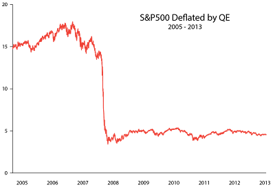
Do you feel wealthy? The Federal Reserve says we are.
The Federal Reserve announced on Monday that U.S. household net worth increased by $1.9 trillion in the third quarter to $77.3 trillion. That is an all-time record. The increase was driven by the value of residential real estate (+$428 billion) and corporate stocks and mutual funds (+$917 billion) during the July-September period.
Of course, that "wealth" is largely the function of a Federal Reserve "ultra easy" monetary policy that has kept interest rates low for over five years. The whole idea is to make you feel "wealthier" so you might spend more. If you spend more they figure the economy should improve. However, we are five years into this theory and we are still looking for that real economic recovery.
However, you have to ask yourself if home sales would really be increasing without the Fed's zero interest rate policy (ZIRP) in which the Fed is purchasing $40 billion of mortgage-backed securities every month?
You also have to ask yourself if the stock market would also be advancing like it has without the Fed's ZIRP. Bear in mind, the Fed is also purchasing $45 billion of treasuries every month. This keeps interest rates low and makes putting your money in a savings account or bond a bad bet. That also makes stocks relatively attractive in comparison and makes them more attractive to buyers thereby increasing prices.
Is any of this real wealth?
Grant Williams, who writes "Things That Make You Go Hmmm", references a chart that Raoul Pal and Remi Tetot of Global Macro Investor put together to provide some context on the reality of the new all-time highs in the S&P 500 in relation to all the trillions of stimulus Fed dollars created through quantitative easing (QE) since 2008.
If you wonder where all that money has gone look no further than this chart. You take out the QE and what do you have left? Not much it seems.
You also can begin to see that when the word "taper" is mentioned (meaning the Fed might cut back on its purchases of federal debt) people may quickly understand that what has really been going on is a gigantic caper. Unfortunately, the mischief and monkey business is going to affect us all.
Back to the prices.
Williams also references a chart on inflation since 2000 that is worth considering if you are still feeling even a little bit wealthy.
Overall, the consumer price index is up 39%, energy is up 122%, college costs have risen 129% and medical care (pre-Obamacare, mind you!) is up 68%. The chart is the work of Doug Short.
Of course, the CPI statistics used today are nothing like they were in 1980 before the Bureau of Labor Statistics modified the calculation to make it more "accurate".
John Williams of ShadowStats prefers to use the same methodology for calculating CPI as was used by the BLS back in 1980 before a lot of the "tinkering" took place, and guess what? Yep... inflation as calculated back then would have been significantly higher than as measured today. How much higher? Ohhhh, about eight times higher:
Calculating inflation like they were pre-1980, inflation has cut almost 40% of the purchasing power of the dollar since 2009 alone!
Does anyone reading this still feel wealthy?


No comments:
Post a Comment